

The above was the old Essential Maintenance Unit notice board put up on top of both lifts at every level of each HDB Board in my area.
It's kind of no fuss but light background with bold dark letterings where 'even the blind can see' type. People with poor eyesights preferred dark letterings over light colored background for easy reading.
Recently they changed it to;
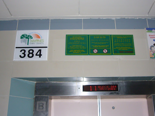
I must admit in general it looks very nice over the old one. The Town Council logo and the block number - a separate piece and very large one, why? Both lifts can share one piece by putting it in the center and there's no need to have it both on each lift.
Now the important one - the notice board itself. The yellow letterings are on dark background (dark green) are smaller and the Toll Free Telephone Number itself are in Red (dark colored) and make it difficult to see from a distance and in the dark (early morning). The Town Council should consider when there is a black out or in the early morning and late evening or bad weather, it's difficult to see the number.
Since the new board is smaller in size than the previous one, the 4 holes left behind by the old notice board are just simply plastered up and you can see the 4 white patches. Does it look nice after this upgrading?
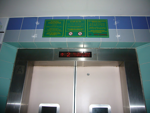
I don't know why use light color letterings over dark background? It is ok for art, but for important notices - it shouldn't. It's difficult to read.
Does this upgrading pieces serve any improvement in services or benefits the residents? I'm not too sure, but I still find it difficult to see the EMU numbers.


No comments:
Post a Comment